During a regular maintenance run on a MacOS X machine I asked Skype to check for software updates. It cheerfully confirmed that a new version of Skype was available for download. I allowed it to download and install the update.
Then I tried to launch Skype which to my surprise came up with “You cannot use the application “Skype” with this version of Mac OS X”.
Now, hang on.
All I did was ask the application to check if there are any updates. Updates that made it work better, closed security holes, improved stability and all that. Not updates that would stop it from working. Given that the local installation of Skype has knowledge of the OS environment and knew this was a Mac OS X 10.4.x , it shouldn’t have suggested the update as there was no possible positive outcome for the end user.
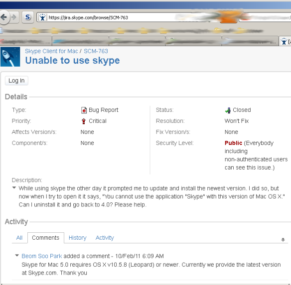
To confirm this was by design and not a software glitch I resorted to the forums, where I found this:
Leaving aside the usability aspects of an application that prompts the user to take its suicidal advice, one has to wonder at the customer service lessons that can be learned here. Skype push out an update killing their own software (under conditions they don’t check), someone takes the time to report this mistake and the answer is “Won’t Fix”.
This is not just annoying, but damaging to the education of end users who are constantly hammered with “always update your software!” from security people.
Guess what real people would rather have: A working but potentially vulnerable version of Skype to talk with their family abroad, or an installation that “cannot be used with your machine”?


